
Five lessons I’ve learned about deliverables that Junior Designer Me could’ve never imagined.
Let me paint you a picture of Junior Me.
I’d whip up a design, slap together a shiny mockup, and send it off to the developers, feeling pretty damn proud of myself.
Did it have error states? Nope.
What about interaction details? Nada.
Empty states? Whoops, forgot about those.
Junior Me thought, “Hey, if it looks good, we’re good, right?”
Wrong. So very wrong.
Fast-forward to now, and my deliverables are unrecognizable compared to those plain mockups of the past. I’ve learned — sometimes the hard way — that the job doesn’t stop at making things look pretty.
As a product designer and now product manager, I’ve realized that great deliverables anticipate problems, answer questions, and make the dev team’s life a whole lot easier.
Here are five lessons I’ve learned about deliverables that Junior Me could’ve never imagined.
1 — Treat Mockups as the Starting Point, Not the Destination
Back in the day, I thought delivering a polished mockup was the endgame. That was the deliverable. The crown jewel.
But here’s the thing:
A mockup without context is like a road map with no destination
Sure, it’s pretty, but it doesn’t actually get anyone where they need to go.
It wasn’t until I started working with dev teams that I realized how many gaps I was leaving wide open. I’ll never forget the time a developer asked me, “What happens if the user deletes all their data? What does that screen look like?” Cue the awkward silence.
Now, I approach every design with a checklist:
- What does this look like with no data?
- What happens if something goes wrong?
- How does the user interact with this element?
Every screen needs a Plan B. And sometimes a Plan C, D, and E. Because guess what? Users don’t live in your perfect, happy-path world.
2 — Treat Error States and Empty States as Design Opportunities
Junior Me thought design was all about the shiny, functional moments — the “Look at this gorgeous dashboard!” kind of stuff.
But design isn’t just about when things go right. It’s about when things go horribly, hilariously wrong.
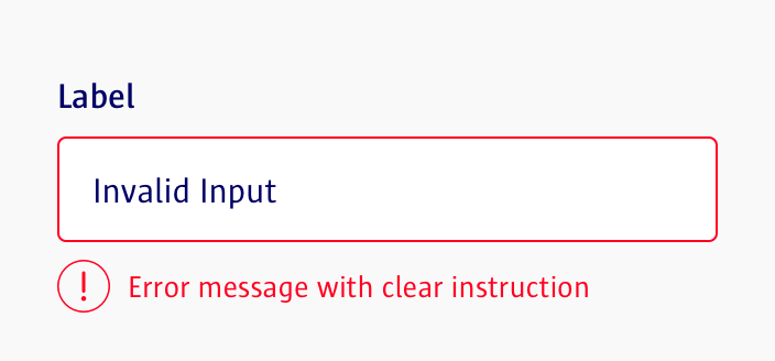
Take error states. If a user tries to submit a form with missing information, they need a clear message that tells them what went wrong and how to fix it. If there’s no data to display, the screen shouldn’t just scream, “NULL.” It should guide the user on what to do next.
Make sure you check the following:
- Error States: What happens when something goes wrong? Missing fields, incorrect inputs, or failed processes should have clear messages guiding the user on how to fix the issue.
- Empty States: What does the interface look like when there’s no data? Add placeholders, instructions, or prompts to guide users toward populating the screen.
- Loading States: What feedback does the user see while the system is processing? Think spinners, progress bars, or animations to reassure users.
I’ll never forget a project where the client saw my mockup and said, “Okay, but what if there’s no data here?” My response?
Blank stare 😳
I hadn’t even thought about it. That was the last time I made that mistake.
Now, I design error states, empty states, and all the other “what ifs” before they even ask.
Here’s the golden rule: if you’re not designing for the worst-case scenario, you’re not designing for reality.
3 — Make Interactions Matter — Even If You Can’t Code Them
One of the biggest lessons I’ve learned is that a static design only tells half the story.
- How does the button behave when you hover over it?
- What does the loading animation look like?
- How does the user know their action was successful?
I used to think, “Well, that’s the developer’s problem.”
Spoiler: it’s not. It’s yours.
Developers aren’t mind readers, and they’re not going to guess what you were envisioning for those interactions. If you don’t provide details, you’re basically handing them a coloring book with no crayons.
Nowadays, I include detailed notes or even quick prototypes to show how interactions should work. Whether it’s hover states, transitions, or microinteractions, these little details make a huge difference in the final product.
✅ Do
Use a design system library as your guide whenever possible.
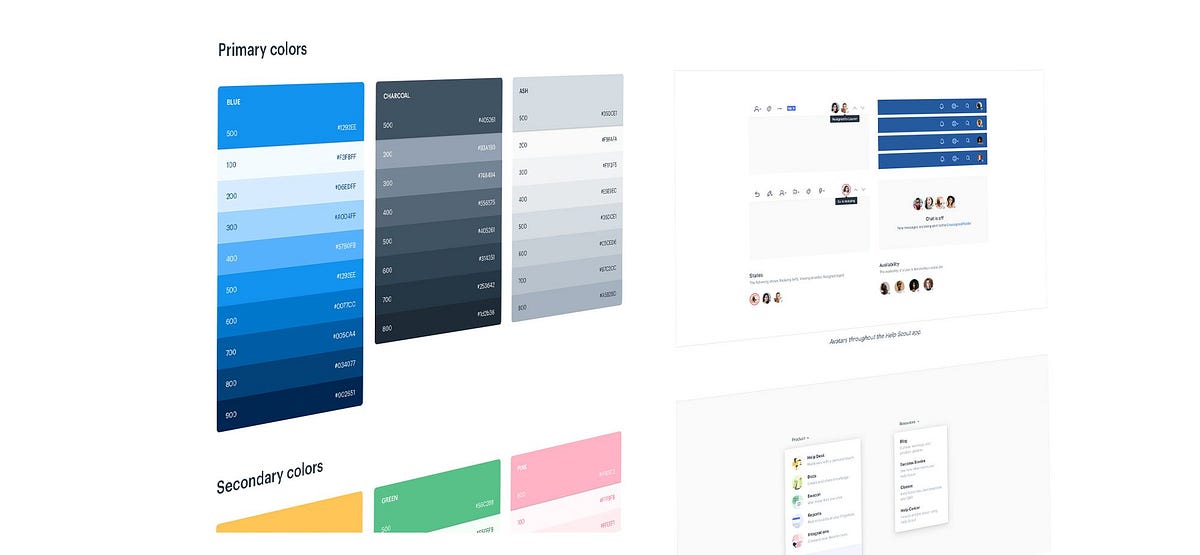
Design systems like Material Design, Carbon Design System, or Ant Design offer predefined components and states that ensure consistency and save time.
They’re like a cheat sheet for polished, user-friendly interfaces. If your project doesn’t have an existing design system, try to reference one of these to align your states and interactions with industry standards.
❌ Don’t
Skip states or assume the developer will figure out what an interaction should look like.
Without specific guidance, you’re leaving too much up to interpretation, which can lead to inconsistency or, worse, a poor user experience.
Incorporating a design system — or building one for your team — ensures that all your hover states, transitions, and error messages not only look great but also function harmoniously across the product.
This extra step might seem tedious at first, but it pays off big time in creating a cohesive, professional final product.

4 — Treat Developers as Collaborators, Not Enemies
Let me be real: Junior Me thought developers were the enemy.
They’d push back on my designs, complain about feasibility, and ask a million annoying questions. In my head, I was the creative genius, and they were the buzzkills.
But here’s the thing: developers aren’t out to ruin your day. They’re trying to make your design actually work. And if they’re asking questions, it’s because you didn’t give them the answers upfront.
One of the best things I ever did was start involving developers early in the process. Before I finalize a design, I run it by them and ask,
“What challenges do you see with this?”
“What might be tricky to implement?”
Not only does this save time later, but it also makes them feel like collaborators instead of code monkeys.
Here’s a quick checklist for involving developers effectively early on:
- Kickoff Discussions: Include developers in project kickoff meetings to align on goals and constraints.
- Walkthroughs: Walk them through your designs in detail, explaining the user flows and key decisions behind them.
- Early Feedback: Ask for their input on feasibility before finalizing the designs. Their feedback can help you avoid unnecessary rework.
- Provide Context: Share your research, personas, or any data that influenced the design. This helps them understand the “why” behind your work.
- Highlight Complex Areas: Point out interactions or features that might need special attention or more time to develop.
- Keep the Communication Open: Regularly check in with them as the project progresses to address any issues early.
By treating developers as true collaborators and involving them from the start, you create a stronger, more cohesive product and a smoother process for everyone involved.
And here’s a bonus: when you respect their input, they’ll respect yours. It’s a two-way street, people.

5 — Details = Respect (for Your Team and the User)
I used to think that overloading a deliverable with details was overkill. But now I see it differently.
When you hand off a design that anticipates every question and accounts for every scenario, you’re showing respect — for the developers, for the users, and for the project as a whole.
When I started including detailed annotations, responsive breakpoints, and even edge-case scenarios in my deliverables, something magical happened: my developers stopped hating me.
Suddenly, they weren’t chasing me down for answers because everything they needed was already there.
And you know what else? Users notice the difference. A design that considers every detail — every interaction, every edge case, every error — feels polished, intentional, and trustworthy.
It shows that you cared enough to think about their experience, not just your own portfolio.
If I could go back and give Junior Me some advice, it would be this: stop focusing on making things pretty and start focusing on making them complete.
Design isn’t just about the happy path; it’s about the messy, complicated reality of how things actually work.
Deliverables aren’t just mockups — they’re blueprints for success. And the more thought you put into them, the better your designs will be. So, embrace the details. Anticipate the questions. And never, ever hand off a design without thinking about what happens when things go wrong.
Trust me, your developers will thank you.
Your users will thank you.
And Future You will thank you too.


